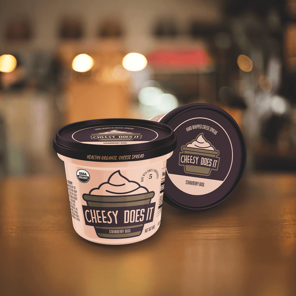
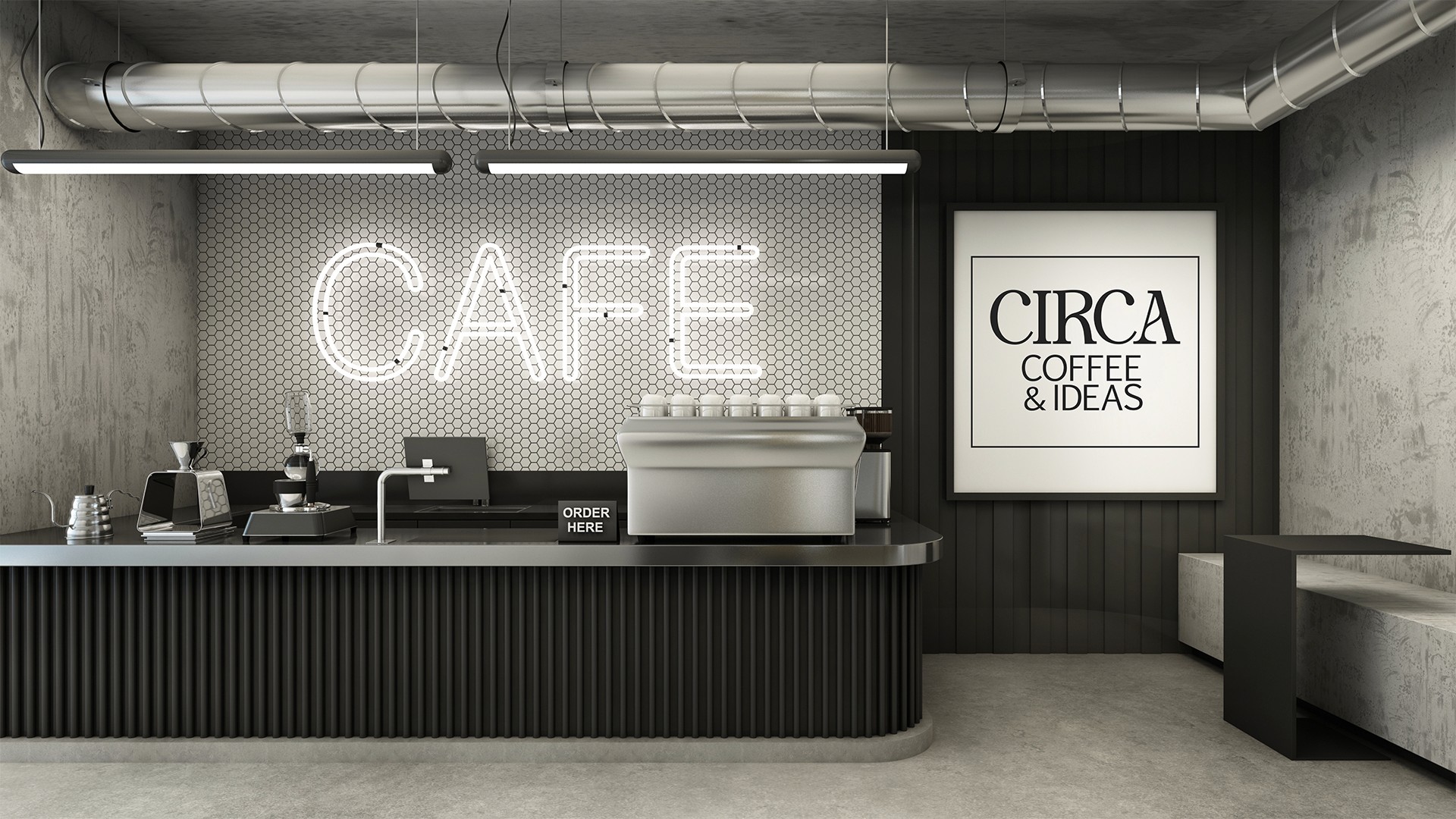
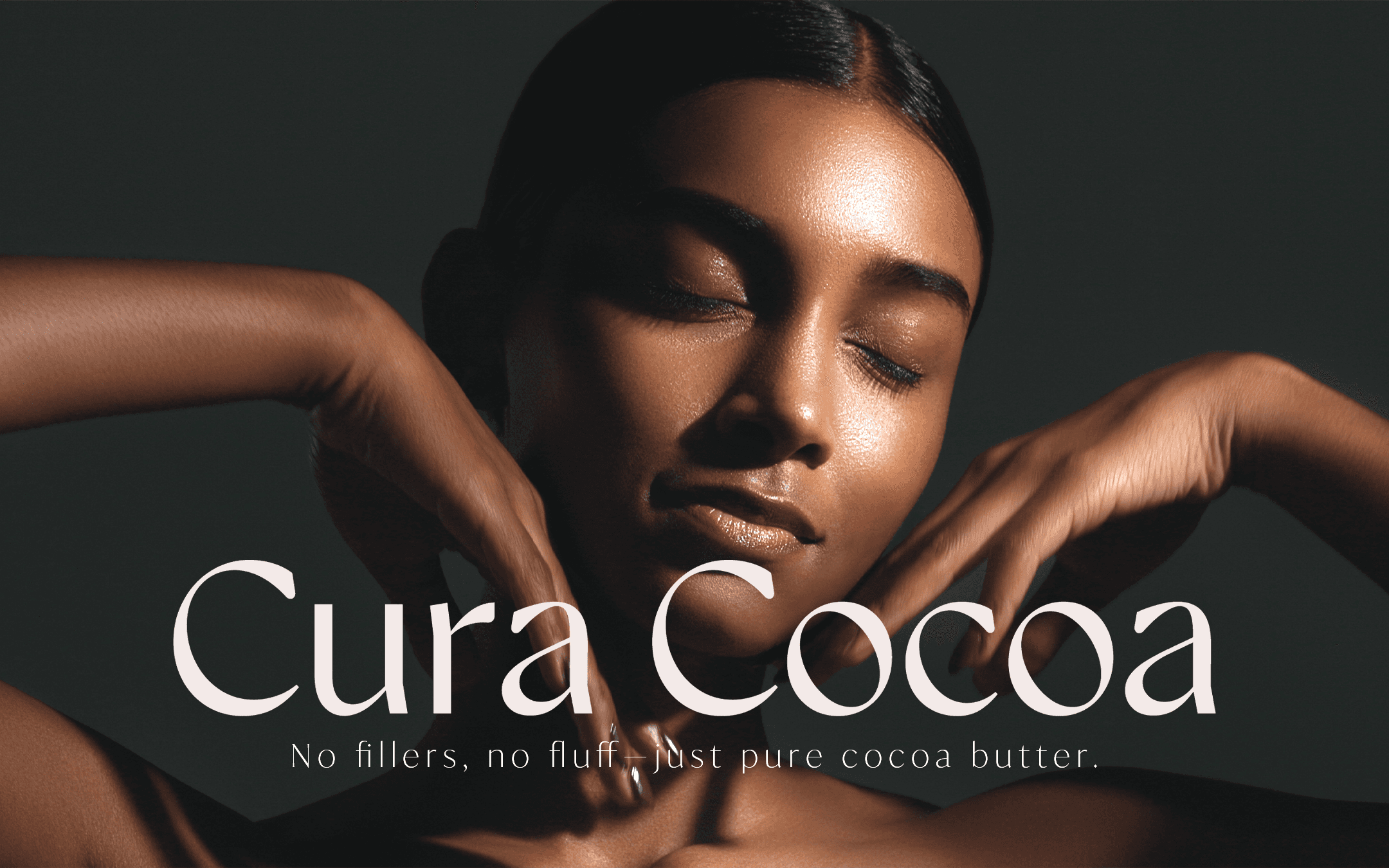
Branding
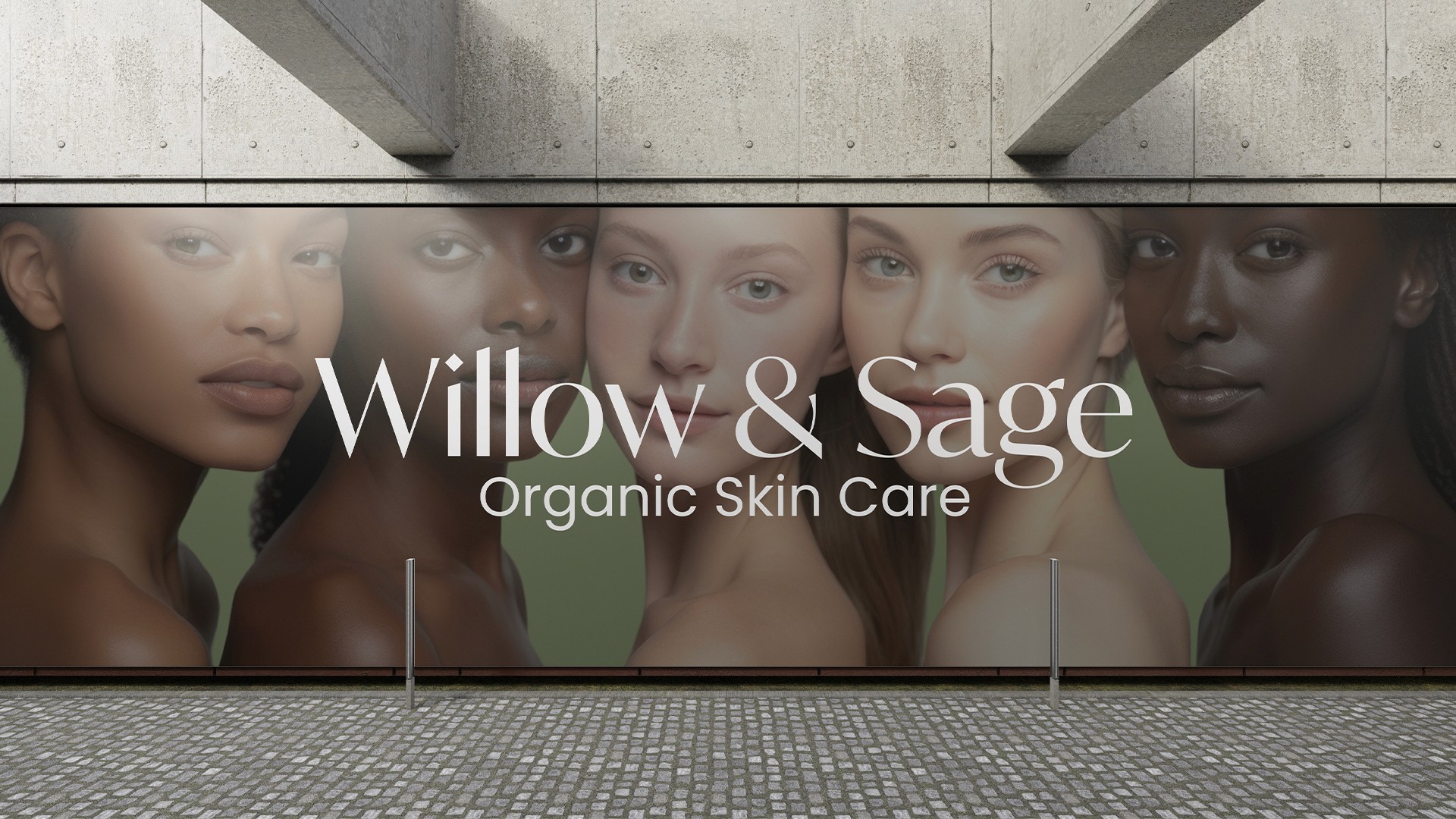
Willow And Sage Skincare
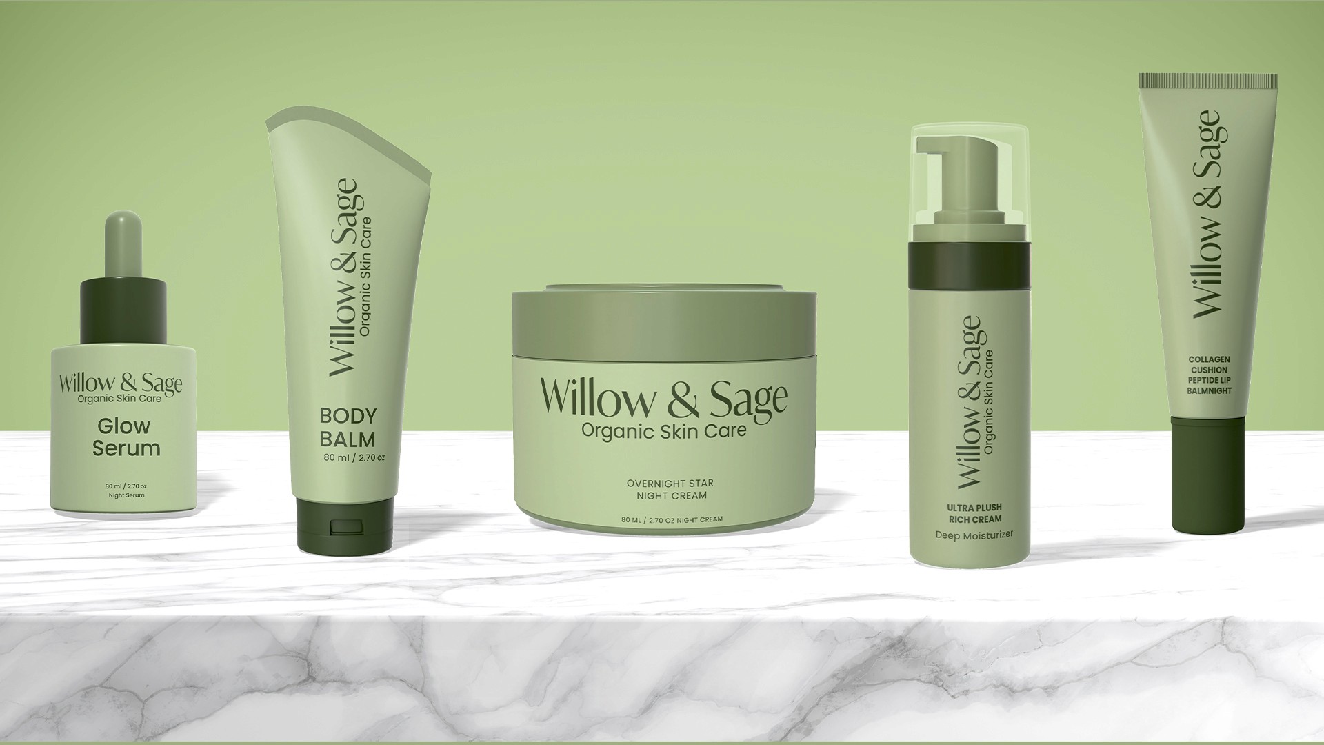
Willow & Sage is a boutique skincare brand that specializes in small-batch, handcrafted organic products using plant-based ingredients.
Year :
2025
Industry :
Beauty
Client :
Willow And Sage Skincare
Project Duration :
6 weeks
Problem :
In the world of skincare, it can be difficult to organic products that are both visually captivating and practical. Many skincare brands either lack a sense of organic flow or fail to stand out due to uninspired design choices.
Solution :
Their mission was to reconnect people with nature through mindful self-care rituals. All products are cruelty-free, sustainably sourced, and packaged with eco-friendly materials. The brand is launching a new identity to stand out in the saturated clean beauty market while maintaining a sense of authenticity and artisan craftsmanship.

Challenge :
One of the main challenges is achieving a seamless blend between the Willow and Sage’s organic approach and the brands aesthetic appeal. The brand wanted to avoid appearing too mechanical or artificial, instead highlighting the natural, fluid qualities of the products.
Another challenge is ensuring the green color remained vivid and harmonious without appearing excessive and avoiding any visual clash or loss of contrast. Maintaining visual interest without overcrowding the composition was also essential.
Summary :
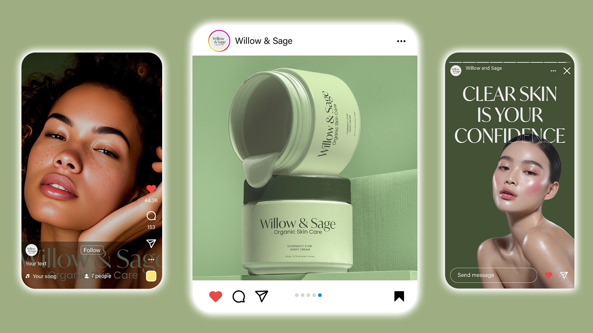
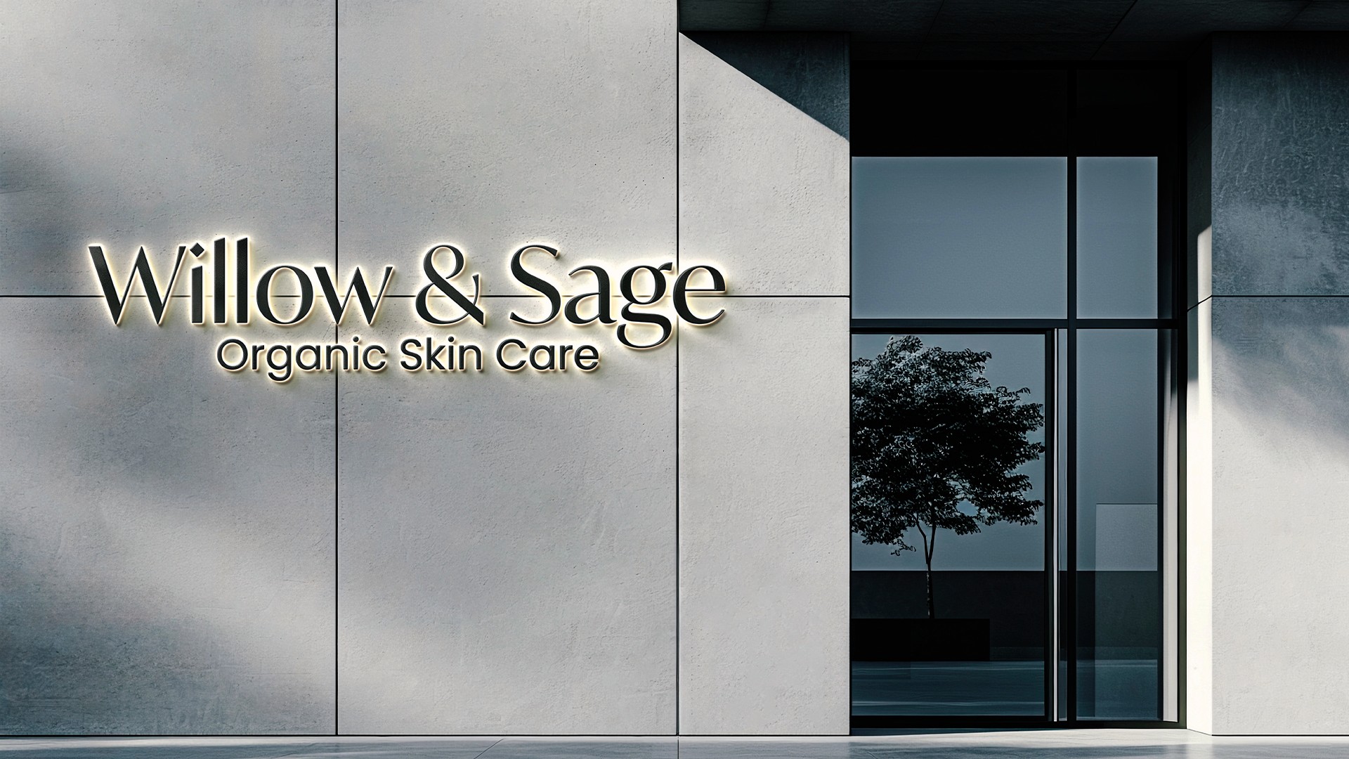
Willow and Sage wanted customers to feel like they’re bringing a piece of a forest sanctuary into their daily routine. The brand feels high-end but approachable. They requested no clichés like leaves in the logo. They wanted something with a story and inspired by apothecary aesthetics but modernized.
This project demonstrates how thoughtful use of color and form can create a brand that is both contemporary and emotionally engaging.

More Projects

Branding
Willow And Sage Skincare
Willow & Sage is a boutique skincare brand that specializes in small-batch, handcrafted organic products using plant-based ingredients.
Year :
2025
Industry :
Beauty
Client :
Willow And Sage Skincare
Project Duration :
6 weeks
Problem :
In the world of skincare, it can be difficult to organic products that are both visually captivating and practical. Many skincare brands either lack a sense of organic flow or fail to stand out due to uninspired design choices.
Solution :
Their mission was to reconnect people with nature through mindful self-care rituals. All products are cruelty-free, sustainably sourced, and packaged with eco-friendly materials. The brand is launching a new identity to stand out in the saturated clean beauty market while maintaining a sense of authenticity and artisan craftsmanship.
Challenge :
One of the main challenges is achieving a seamless blend between the Willow and Sage’s organic approach and the brands aesthetic appeal. The brand wanted to avoid appearing too mechanical or artificial, instead highlighting the natural, fluid qualities of the products.
Another challenge is ensuring the green color remained vivid and harmonious without appearing excessive and avoiding any visual clash or loss of contrast. Maintaining visual interest without overcrowding the composition was also essential.
Summary :
Willow and Sage wanted customers to feel like they’re bringing a piece of a forest sanctuary into their daily routine. The brand feels high-end but approachable. They requested no clichés like leaves in the logo. They wanted something with a story and inspired by apothecary aesthetics but modernized.
This project demonstrates how thoughtful use of color and form can create a brand that is both contemporary and emotionally engaging.
More Projects
Branding
Willow And Sage Skincare
Willow & Sage is a boutique skincare brand that specializes in small-batch, handcrafted organic products using plant-based ingredients.
Year :
2025
Industry :
Beauty
Client :
Willow And Sage Skincare
Project Duration :
6 weeks
Problem :
In the world of skincare, it can be difficult to organic products that are both visually captivating and practical. Many skincare brands either lack a sense of organic flow or fail to stand out due to uninspired design choices.
Solution :
Their mission was to reconnect people with nature through mindful self-care rituals. All products are cruelty-free, sustainably sourced, and packaged with eco-friendly materials. The brand is launching a new identity to stand out in the saturated clean beauty market while maintaining a sense of authenticity and artisan craftsmanship.
Challenge :
One of the main challenges is achieving a seamless blend between the Willow and Sage’s organic approach and the brands aesthetic appeal. The brand wanted to avoid appearing too mechanical or artificial, instead highlighting the natural, fluid qualities of the products.
Another challenge is ensuring the green color remained vivid and harmonious without appearing excessive and avoiding any visual clash or loss of contrast. Maintaining visual interest without overcrowding the composition was also essential.
Summary :
Willow and Sage wanted customers to feel like they’re bringing a piece of a forest sanctuary into their daily routine. The brand feels high-end but approachable. They requested no clichés like leaves in the logo. They wanted something with a story and inspired by apothecary aesthetics but modernized.
This project demonstrates how thoughtful use of color and form can create a brand that is both contemporary and emotionally engaging.